 Revnova
Practice websites sell procedures to people who are afraid
Dental websites almost always look the same: a stock photo of a smile, a list of procedures in Latin and a price list. But a patient looking for a new practice is usually not weighing up what a ceramic veneer costs — they are weighing up whether it will hurt, whether they will be judged for how long they have stayed away, and whether anyone will get back to them at all. A website that speaks to that anxiety wins the patient the price list drove off.
Visual calm as the main argument
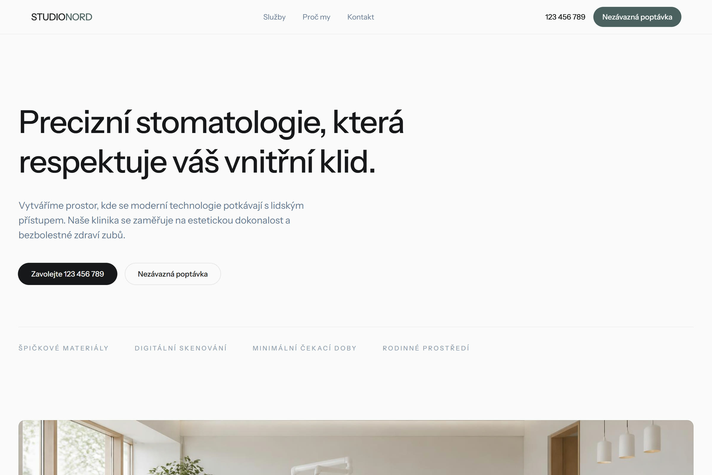
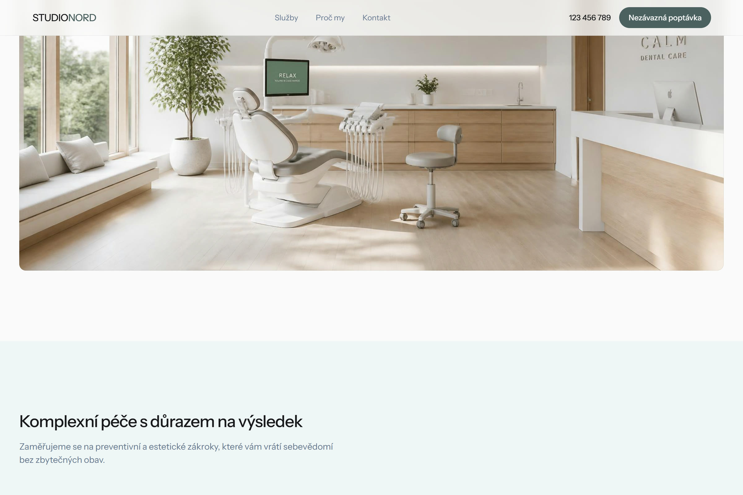
The whole site rests on quiet. Light surfaces, plenty of empty space, one muted accent colour, no exclamation marks and no countdowns. The headline does not read “A dazzling smile in one afternoon” but “Precise dentistry that respects your peace of mind” — the word peace deliberately comes before any procedure. A full-width photograph of the surgery shows a light room with wood and large windows, because that is precisely what the patient needs to be able to picture.
The second decision is to rewrite the services out of clinical language and into the patient’s. Not “dental hygiene with Air-Flow”, but “healthy gums for life”. Not “ceramic veneers”, but “an invisible repair to your teeth”. The clinical term stays in the description — the patient will find it if they want it, but they decide on the outcome they understand.
Three services, three certainties, one phone number
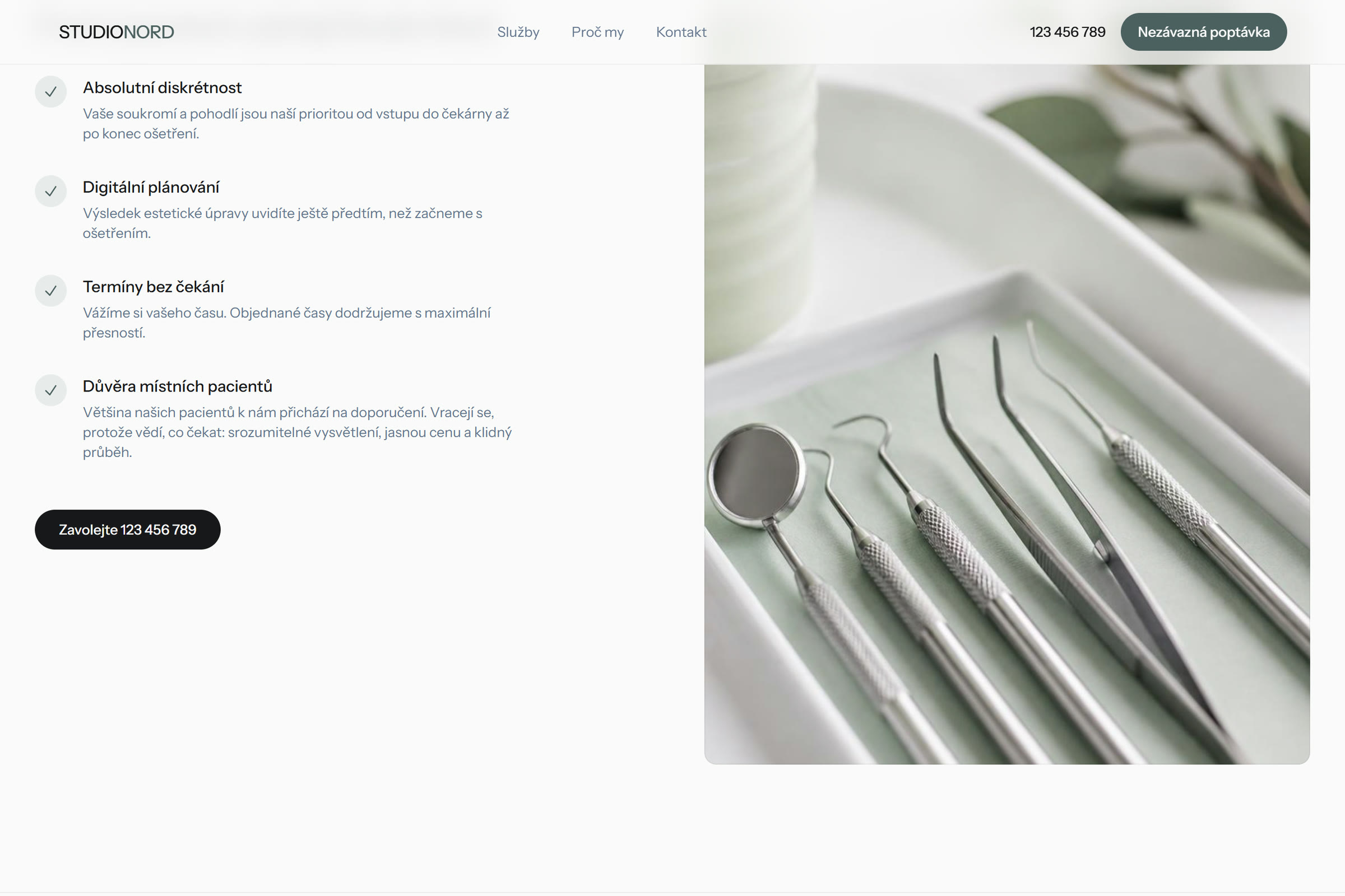
The structure is deliberately short: three services, three reasons, a form. The reasons answer exactly the worries the patient arrived with — discretion, digital planning that lets them see the outcome in advance, and appointments that are kept without waiting-room time. Every service card ends with a link to the phone, because booking a dentist is still most often settled in a call.
Technically it is a static page with no database and no server: nothing can break and nothing loads slowly. For a healthcare site that has one further reason behind it — the less the site does, the less data about the visitor comes into being, and searching for a dentist is a more sensitive fact than it looks.
There are deliberately no reviews. In healthcare an invented patient rating is not only untrustworthy but ethically over the line — and exactly the kind of detail that makes somebody close the tab. So Studio Nord speaks about the trust of its patients in general terms and leaves the stars empty until they are real.


An appointment, not click-throughs
Wherever the patient ends up — at the services, at the reasons or down at the form — they are always one tap from booking. The practice does not care about time on site or pages viewed; it cares about a filled appointment slot.
We measure conversion by appointments and calls — and because Studio Nord is a fictional brand, we are not going to invent any figures. What can be measured: the site is static, light and opens practically instantly, holds full contrast and works with a screen reader. On a healthcare site accessibility is part of the brief, not a bonus — a patient with impaired sight books an appointment just as often as anyone else.
Open the live demo Studio Nord — in CzechThis is how we build websites for surgeries and practices that need a full diary — if that is your situation, get in touch and we will go through what it would involve for you.
Book a consultation