 Revnova
On the juice shelf everybody claims the same thing
A hundred per cent fruit, no added sugar, fresh, honest. Every bottle on the shelf says the same words, so none of them says anything. A small brand has no budget to shout them down — and the website is the only medium where it has unlimited time and complete control of the telling. SUNFALL has just one sentence that sets it apart: we press only what fell on its own. The brief was to turn that sentence into an experience rather than a paragraph.
The brand is named after a fall. So the whole site falls.
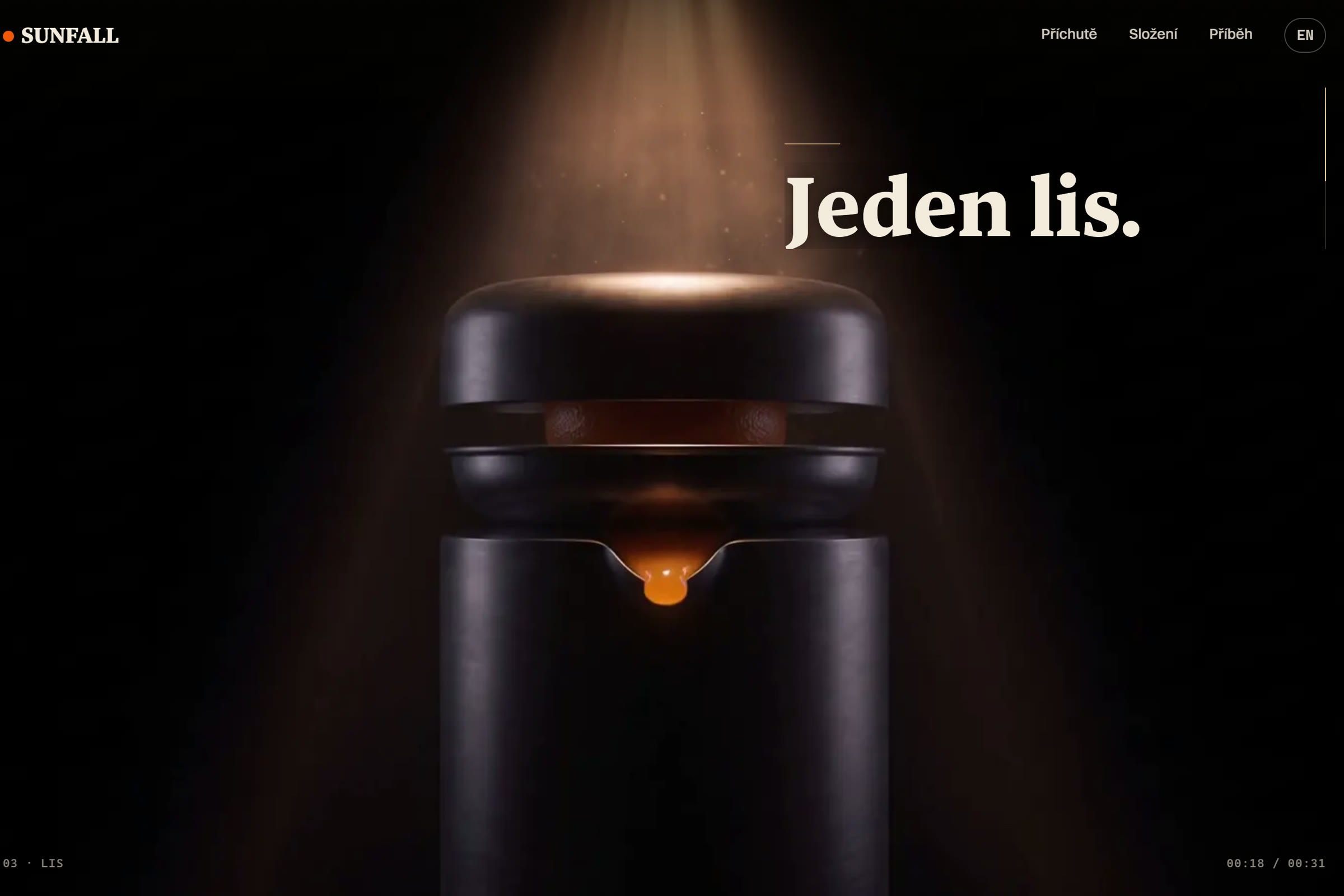
You know a ripe orange because it falls — and the brand takes its name from that. So the opening film is not a montage of the grove and the production line: it is one continuous fall. Through the whole shot the camera never lifts and never cuts; the letting go, the flight through soil, the grip of the press, the stream of juice, the bottle, the cap, the turn onto the label. The same movement then returns in miniature: the sun-dot falls into the wordmark, into the headings and into the footer. One idea, carried through, nothing extra anywhere.

The second decision is quiet. Short sentences, no exclamation marks, numbers only where they are the composition of the product: twelve oranges in a bottle, zero grams of added sugar, forty-eight hours from landing to bottling. The site does not persuade — it states, and leaves the viewer to work the ripeness out for themselves.
One shot that was never filmed
The film was generated: six clips chained so that each one begins on the actual last frame of the one before — we measured the joins by the similarity of neighbouring frames, which is why the whole thing holds as a single shot. On the page it plays frame by frame on a canvas; the scroll distance is computed from the length of the film in pixels rather than from the height of the window, so the pace of the ride is identical on every monitor. The opening card with the wordmark runs on a timer instead of on the scroll — an earlier version tied to the scroll hid the first eleven per cent of the film from the viewer, and that is exactly the kind of mistake you only catch by measuring.
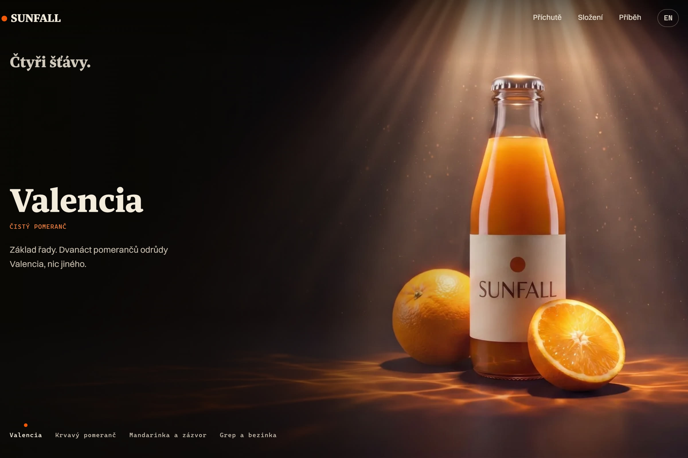
The sections below the film keep the same discipline: four flavours as full-bleed shots where the colour of the light belongs to the flavour, and a typographic ride through 48 hours where the background brightens only as far as the ceiling at which the text still holds 4.5:1 contrast at every point of the pass — measured every two per cent of the distance, not estimated. The whole site exists in Czech and English from a single source of copy, and without JavaScript it collapses into a readable static page.


A cinematic spot with no shooting day
A shot that would once have meant a CGI studio and weeks of post-production was produced by generative chaining for a fraction of the cost of a single shooting day. For a small brand that means cinematic language is no longer a privilege of corporate budgets.
We do not measure a scroll-film by conversion — no credible study supports that link and we are not going to pretend otherwise. We measure it by brand exposure and by the time a visitor spends with the brand: with a drink costing a few tens of koruna, what decides is whether you remember the name, and thirty seconds of concentrated ride is more than the brand gets anywhere else. The engineering must spoil none of it: the page holds full contrast and works with a screen reader, with animation switched off and without JavaScript.
Open the live demo SUNFALLThis is how we build every website for a product that sells on its story — if that is your situation, get in touch and we will go through what it would involve for you.
Book a consultation